
Build Accessible Form Fixtures That Catch Real Bugs
Turn labels, autocomplete tokens, grouped controls, errors, and keyboard behaviour into explicit form-testing contracts using live demos and editable fixtures.
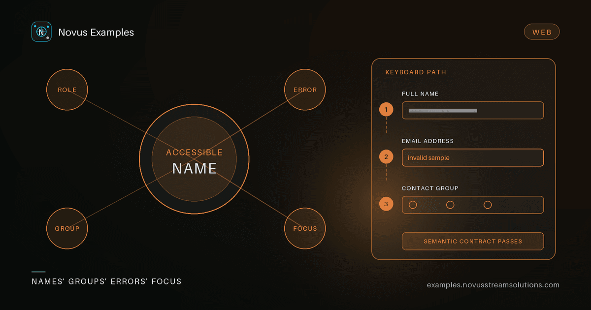
A happy-path form test usually fills a few inputs, clicks Submit, and checks for a success message. That proves the endpoint received something. It does not prove a screen reader can identify each field, an autofill engine understands the requested data, keyboard focus reaches the error, or a scraper maps a visible label to the right control.
An accessible fixture makes those relationships explicit. It gives automation a stable contract and gives people the same information through more than visual proximity.
Novus Examples provides both live form demos and downloadable form files. Use the live pages for interaction and focus behaviour; use the files and Form Studio for structure, export, and mutation tests.
Before writing selectors, list the fields the workflow actually needs. For each one record:
- the visible label;
- the submitted
name; - the input type or control role;
- whether it is required;
- its autocomplete purpose, when it represents personal data;
- valid and invalid example values;
- the expected error message;
- any group it belongs to.
This inventory prevents a common test smell: selectors that pass because they target #field-7, even though the user-facing label now points at a different input. The contract should be “Email labels the email control,” not “the DOM still contains an id we happened to copy.”
In Form Studio, start from a blank form for a minimal case or open a catalog fixture when you want realistic fields. The catalog browser searches field names and labels, so terms such as “routing number,” “NPS,” or “HS code” can find a useful starting point even when they are absent from the form title.
Visible text beside an input is not automatically its accessible name. A reliable HTML fixture associates the <label> and control with for and id, or nests the control inside its label. A PDF fixture needs a meaningful field name and tooltip rather than a painted caption that no widget exposes.
In browser automation, prefer role-and-name queries:
const email = page.getByRole("textbox", { name: "Email address" });
await email.fill("qa@example.test");
That selector fails when the relationship breaks, which is exactly what an accessibility regression test should do. A CSS selector can keep passing while the accessible name disappears.
Add one negative assertion too: a decorative heading should not become the field's name by accident, and two controls should not share the same name unless they are intentionally grouped.
Browsers and assistive technology cannot reliably infer that “Mobile” means a telephone number or that “ZIP” is a postal code in every locale. The autocomplete attribute supplies that purpose.
Useful fixtures include tokens such as name, email, tel, street-address, postal-code, country-name, organization, username, new-password, and current-password. A checkout flow may need section prefixes such as shipping postal-code and billing postal-code so the same data type appears in two distinct contexts.
Test the attribute as part of the contract. Do not assert that a browser must show a particular autofill UI—browser profiles and privacy settings differ. Assert that the document provides enough semantics for an autofill engine to make the decision.
Radio buttons represent one choice and share a submitted name. Checkboxes may represent independent booleans or a multiple-choice group. A <fieldset> with a <legend> gives the collection a name that individual option labels cannot provide.
A good fixture lets your test distinguish:
- the group name, such as “Preferred contact method”;
- the option name, such as “Email”;
- whether one or many options may be selected;
- the exact value submitted for each option;
- whether the whole group is required.
This catches parsers that flatten every control into an unrelated field and fillers that check every radio because each input looked independently selectable.
Sectioned catalog forms retain their fieldsets when opened in Form Studio and when exported. Use one of those fixtures when section boundaries are part of the assertion rather than reconstructing the relationship from a screenshot.
Native constraints such as required, type="email", min, max, and pattern are useful, but a production workflow often adds its own messages. An accessible error contract has three parts:
- the field enters an invalid state;
- the message is programmatically associated with that field;
- focus or a live announcement makes the failure discoverable after submission.
Test the sequence, not only the final text. Submit an empty required form with the keyboard, verify which field receives focus, correct that field, submit again, and confirm the next failure becomes reachable. Then complete the form and verify the success state does not leave stale error attributes behind.
For pattern-based fields, provide a human-readable hint. A regular expression alone is not an instruction. If a fixture accepts A1A 1A1, the page should explain that format before the user fails it.
Real bugs tend to hide outside text and email inputs. Add targeted fixtures for:
- a select with an empty placeholder option;
- a radio group and a checkbox group on the same page;
- a file input, which automation must handle through the browser's file API;
- date, number, range, and colour controls with browser-supplied defaults;
- a disabled field and a read-only field, which are not equivalent;
- repeated personal data in shipping and billing sections;
- a honeypot that must not enter the visible or accessible reading order.
The full contact demo and downloadable examples provide a broad inventory. For one precise regression, clone the nearest form in Studio and remove everything unrelated. Smaller fixtures make failures easier to diagnose.
The live React demos and downloadable files intentionally serve different purposes. A live page is the right place to test focus, keyboard flow, conditional UI, browser validation, and a submit result. A downloaded HTML or PDF is the right place to test parser output, stable field names, and import/export behaviour.
Do not make one test prove both. Instead, write two contracts that share the same field inventory:
- an interaction test against the live page;
- a structural test against the exported HTML, JSON, or PDF.
That separation tells you whether the regression is in the experience or in the artifact. It also prevents a browser-only assertion from being mistaken for proof that a generated PDF has valid widgets.
For each important form, verify:
- Every control has the expected role and accessible name.
- Personal-data fields carry appropriate autocomplete purposes.
- Radio and checkbox groups expose both group and option labels.
- Required and format constraints reject the intended invalid values.
- Errors are associated, announced or focused, and cleared after correction.
- Keyboard order follows the visual and logical sequence.
- Exported field names, values, required flags, and options match the source definition.
- Locked SAMPLE markings survive edits and exports on sensitive fixtures.
This is not an accessibility certification. It is a reproducible test contract that catches common semantic regressions before a broader audit. Start from Form Studio, compare the live forms, and use the browser-automation targets when you need adjacent focus, dialog, iframe, or table behaviours.
Continue this workflow
Was this article helpful?
Found an error? Send a correction.