
Font Fixtures That Expose Fallback Bugs
Variable axes, COLR palettes, metrics that disagree, and a deliberately broken checksum. The font cases that break renderers, subsetters and export pipelines.
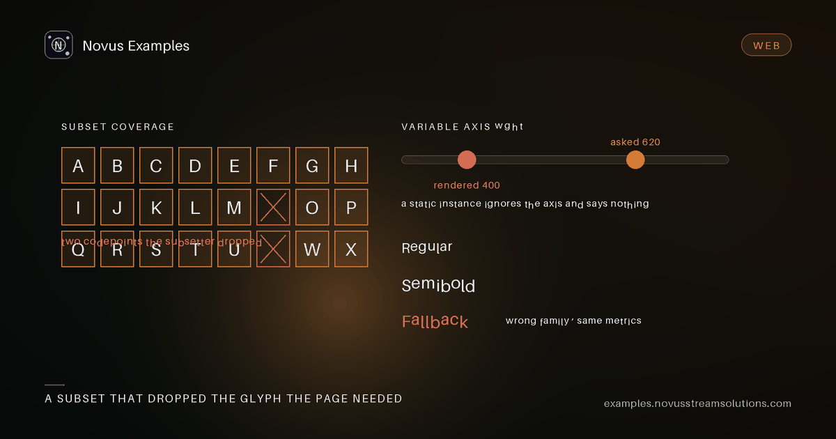
Nothing throws. The text renders. It is just the wrong weight, or clipped at the top, or set in a fallback face that nobody chose, and it usually reaches a customer before it reaches a bug report.
The font catalogue is 100 fixtures built around a single made-up family, which is the point: one controlled face with deliberate variations beats a pile of real fonts whose licences you cannot verify and whose quirks you cannot separate from your own bugs.
Four fixtures, and understanding them explains most vertical-layout complaints:
novus-metrics-all-families-agreeis the control. The three sources of vertical metrics that a font can carry all say the same thing.novus-metrics-families-disagreeis the realistic case.hhea,OS/2typo metrics andOS/2win metrics disagree, which they do in an enormous number of shipping fonts.novus-metrics-use-typo-metrics-bittoggles the flag that tells a renderer which pair to believe.novus-metrics-uswin-clippingis the failure itself: ascenders and descenders that exceed the win metrics and get cut off by renderers that clip to them.
The reason this matters beyond the browser is export. A layout that looks correct on screen and clips in a generated PDF is almost always these four fixtures disagreeing, and no amount of CSS line-height will fix it because the constraint is inside the font.
novus-metrics-external-leading and novus-metrics-vertical-writing extend the same idea into
line spacing and vertical text.
The variable-axes group gives one axis at a time: novus-grotesk-vf-weight-axis,
novus-grotesk-vf-wdth-axis, novus-grotesk-vf-slnt-axis and novus-grotesk-vf-opsz-axis, with
WOFF and WOFF2 wrappers for the weight axis.
The variable-instances group is the same design exported as static fonts:
novus-grotesk-static-instance-light through -black, plus -condensed-bold.
Testing them together answers the question that actually matters: does your pipeline produce the same rendering from the variable font at weight 700 as from the static bold? If it does not, you have either an axis-mapping bug or a fallback that is quietly substituting a synthetic bold, and synthetic bold is the one that looks acceptable until someone compares.
novus-variable-sample-wg-woff2 is the one to use when testing web delivery specifically, because
WOFF2 compresses variable fonts very differently from static ones and a subsetter that mishandles
the process usually produces a file that loads and renders a single weight.
novus-color-colr-v0-layersis the older model: flat coloured layers.novus-color-colr-v1-gradientsis the newer one, with gradients and transforms.novus-color-cpal-four-palettescarries several palettes in one face, which is how dark-mode colour fonts work.novus-color-colr-over-cffcombines colour layers with CFF outlines rather than TrueType ones.
A renderer that supports COLRv0 and not COLRv1 does not usually error. It draws the base glyph in black, which is a perfectly reasonable-looking result that is nonetheless wrong.
novus-subset-full-face, novus-subset-latin-basic and novus-subset-headline are the same font
at three coverage levels, each in TTF and WOFF2.
Subsetting is a deliberate trade: fewer glyphs, smaller file, and any character you did not anticipate falls back. The headline subset is the aggressive case, and the test is not whether it loads but what happens to a character it does not contain. A visible fallback is fine. A blank box is not, and neither is a silent substitution that changes the line width and reflows the page.
novus-layout-ligatures, novus-layout-kerning-gpos, novus-layout-kerning-legacy-table,
novus-layout-contextual-alternates, novus-layout-small-caps and novus-layout-stylistic-sets.
The pair worth attention is the two kerning fixtures. Modern kerning lives in a GPOS table;
legacy kerning lives in a kern table. Some renderers read one, some the other, and some read
kern only when GPOS is absent. Text set with the wrong one is not broken, just slightly loose
or slightly tight, which is exactly the kind of difference that survives review and then looks
wrong next to a design mock.
novus-outlines-truetype-quadratic and novus-outlines-cff-cubic are the two curve models.
novus-outlines-composite-glyphs and novus-outlines-decomposed-glyphs are the same shapes built
by reference versus drawn directly, which matters to anything that converts fonts to paths.
novus-outlines-overlap-flags carries the flag that says overlapping contours should be merged,
and a converter that ignores it produces holes where shapes intersect.
The collection group covers TTC files, where several faces share tables:
novus-collection-shared-tables and novus-collection-unshared-tables differ in exactly that,
and a naive extractor that pulls one face out of a shared collection can produce a font missing
the tables it was borrowing.
novus-integrity-checksum-reference is correct. novus-integrity-broken-head-checksum and
novus-integrity-broken-table-checksum are deliberately wrong in two different places.
Validators disagree about whether to reject these, and both answers are defensible. What is not defensible is accepting them silently and failing later somewhere unrelated. These two exist to tell you which of the three your pipeline does.
novus-metrics-families-disagreeandnovus-metrics-uswin-clippingfirst, because vertical clipping is the most common complaint and the least obvious cause.- The variable/static comparison, because synthetic fallbacks hide there.
novus-subset-headlinewith a character it does not contain.novus-color-colr-v1-gradients, if you render colour fonts at all.novus-integrity-broken-head-checksum, to find out what your validator actually does.
Every face here is generated, licence-clean and byte-pinned, so you can commit a failing case to your own repository without a rights question.
Continue this workflow
Documentation and troubleshooting
Was this article helpful?
Found an error? Send a correction.